NDTV’s existing experience made that difficult. We wanted to change that.
Regional Readers
who need easy access to local news, often in native languages
Live News Enthusiasts
who rely on real-time coverage, especially during big events
A full UX redesign of NDTV’s website.
The original site, while rich in content, struggled with:
What was the challenge?


🎛️ Font resizing, save-for-later, light mode
📡 Reduced redundancy, improved video experience
📺 Gave users options to hide pop-ups, autoplay videos
🧹 Prioritized readability with clear hierarchy
We restructured the site for usability and clarity.
Lo-Fi Mockup
The Goal


Redesign it for clarity, accessibility, and personalization.
So users can actually read the news—not wrestle with the interface.
Because news should inform, not overwhelm.
Today’s digital users—especially mobile readers—demand:
Why does it matter?
Who is it for?
Casual News Seekers
who want quick updates and trending stories


The design system focuses on clean layouts, legible typography, and minimal color usage to support readability.
Design System

Homepage
NDTV Reimagined

Article Page

All three personas had one thing in common:

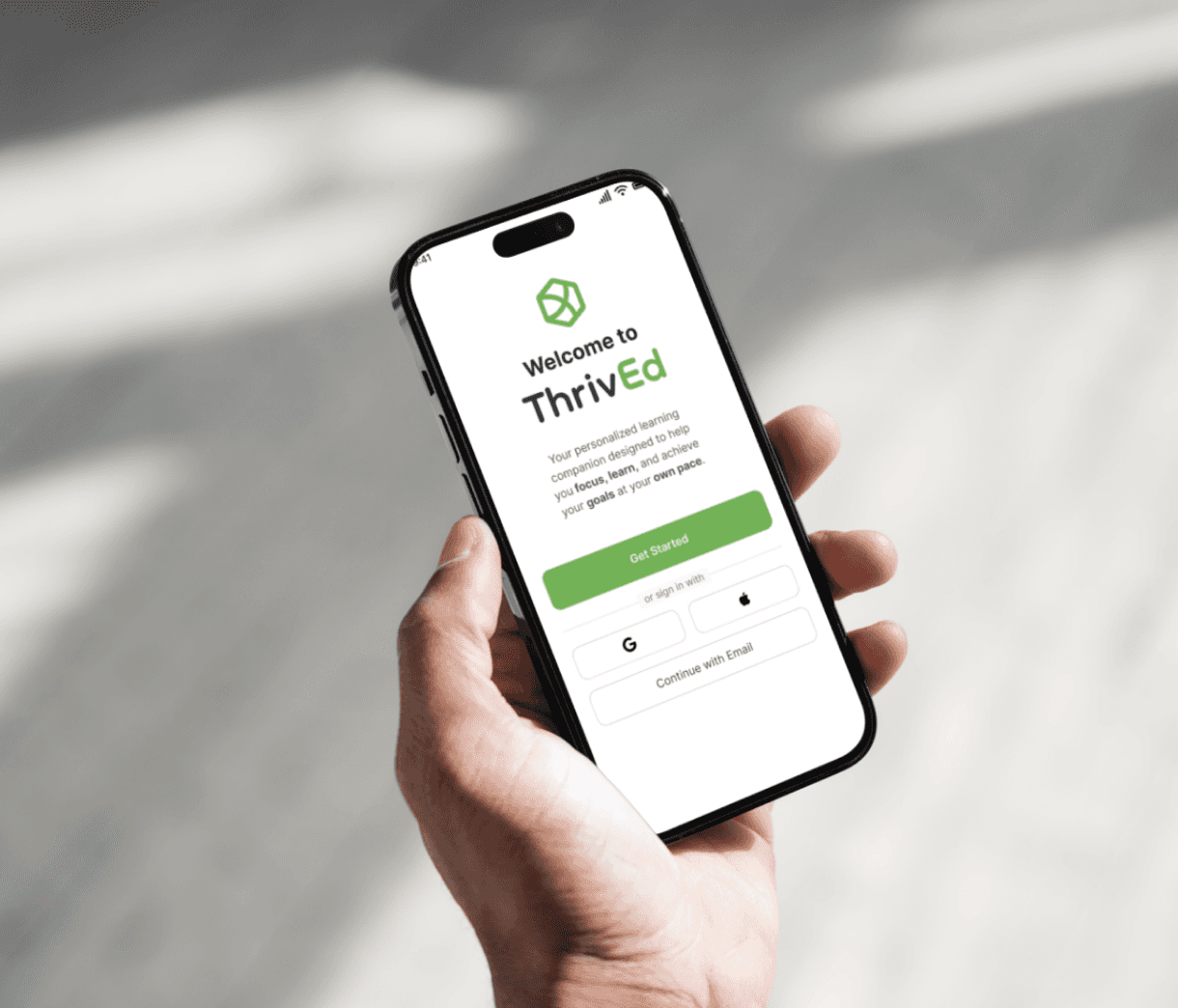
A calm, clear, and genuinely supportive learning environment. ThrivEd doesn’t just teach—it understands how you learn.
Content-first.
Distraction-free.
Made to read.


Live News Page

Customization/ Settings Page

Article Page
Visual Clutter
Clean Layouts
Poor Readability
Less Noise
Excessive Ads
Fast, easy access to what matters
Options to control how they read
🧠 They were overloaded by the current UI.
🎯 They wanted simplicity and control.
NDTV REDESIGN
Cleaner Way to Stay Informed.

Reimagined NDTV’s content-heavy website with a cleaner, more intuitive user experience — reducing clutter, enhancing personalization, and delivering news with clarity.
Type: Individual Project
Time: 20 Hours
Tools: Figma

📫 Say hi:
🔗 Connect:
📄 Resume:
💻 Behance:
More Projects to look at!